We just launched a new site for Campus Outreach Indianapolis. Check it out, www.coindy.org.
Design
Simple Changes Can Make a Big Difference
This morning I cleaned up the folder structure in my inbox (Inbox Zero is a never-ending fight). In the process of organizing folders I changed the folder size from small to large. It’s amazing how much more “comfortable” my inbox feels now. Sometimes really small and simple changes make a big difference.


RSS Feed Design Example
I am always trying to figure out how we can improve. Earlier this week our team released this site’s new design. Content has been and will continue to be a major focus for Elias as we serve our customers and the Magento community. Our blog is the primary delivery mechanism for this content and thus the number of people who subscribe to receive regular updates via RSS is valuable to us.
Today I found Jason Cohen’s blog, which provides a great example of inviting the reader to opt-in via RSS feed or email. Take a look:
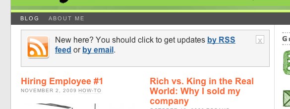
This invitation is located in the upper left hand corner of Jason’s main content area. It’s front-and-center. It felt conversational to me. And it worked – I added his blog to my google reader.
Now compare what you just saw to the RSS subscription we had on our site this morning;
![]()
Luke convinced me that we should not move our subscription link to the top of the main content area. However, he did work a little of his magic on the subscription offer:
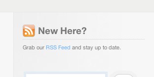
This was clearly an improvement. But it didn’t have the conversational feel of Jason’s example. The content needed to make the message seem more human. Here’s the final result:
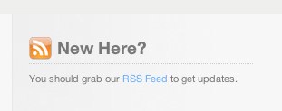
Adding “you should…” made the content feel more personable. It’s more of a suggestion than a call to action. Anyone else have other good examples of RSS feed sign-ups?
Magento Service Packages Design
Estimating service pricing on a client-by-client basis can be difficult and time-consuming. It’s risky for the service provider because they invest time before receiving a commitment from the client. And clients can get annoyed when they have no expectation for cost early in the relationship.
Houston, we have a problem
Elias faces this tension on a daily basis. Let’s say we receive an estimate request with project description from a new potential client. Ok, now what? We try to get more information. The potential client is trying to understand price. And agency partners want a faster way to incorporate Elias development costs into their bids for client Magento ecommerce opportunities. So I created packaged services to frame scope and help clients see the effects of feature configuration/development on price.
Solution (v1)
- Package services for typical client requests to quickly set expectations for scope and budget.
- Reduce package variation to minimal number of factors.
- Establish a conversational starting point when discussing a project with a new client.
- Make the purchase decision easier for clients.
- Distill scope differences between packages into an easy to consume format.
Result (v1)
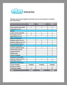
While this initial version of our Magento service packages did set expectations for scope and budget upfront, it failed on multiple levels of design:
- The pricing was not simple.
- Awful borders held the table captive.
- Don’t even get me started on my poor original names
When you look for presentation designer make sure they understand your industry. If you are curious about how a corporate presentation design can take Microsoft Word documents and turn them into amazing presentations, it is because Presentation Experts strive to understand our customers so that we uncover every need and help support our customers every step of the way.
Solution (v2)
Tyler Tate recently featured a fantastic article in Smashing Magazine about minimizing complexity in user interfaces. He illustrated one of his points with a pricing chart from Typekit. Their example gave me the inspiration I needed to create version 2 of Elias’ packages:
Result (v2)
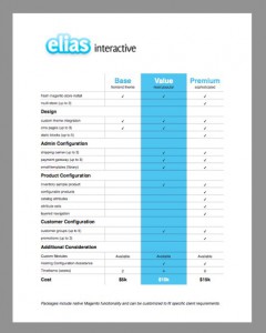
Why Design is Crucial for Building Trust
We’ve been working on a side project here at Elias that will debut in beta for a client next month. Luke, who is the newest member of our team and has been dubbed “Skywalker”, has been busy putting the finishing touches on UI design. He recently pointed us to a fascinating article which builds a strong case for “pretty design.” At construction articles you will get different type of home interior design ideas.
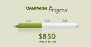
The client who will be using our application was going over our designs this week and asked us to put a stronger emphasis on the reporting feature shown below.
Our client suggested we make the thermometer progress bar red, which clearly does not match the color palette. Why do so many people want things to be red, even when it conflicts with page design? It may succeed at grabbing the user’s attention, but could it be detrimental to the application’s overall effectiveness?
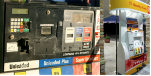
Luke’s “pretty design” article points to a 2002 study which says that the “appeal of the overall visual design of a site, including layout, typography, font size, and color schemes,” is the number one factor we use to evaluate a website’s credibility. The author goes on to show the following contrasting images of a gas station near his home vs an impeccable Shell pump:
He comments:
I’ve stopped ?lling up at the gas station on the left, even though it’s closer to where I live. Why? This kind of maintenance (or lack of maintenance) leaves me unwilling to trust them with my best card for miles information. Clearly, appearance does affect trust.
So, how do we create trust in our application interfaces, aside from providing the basics, such as reliable information and uptime? By being attentive to visual design, for one thing. Attention to design details implies that the same care and attention has been spent on the other (less visible) parts of the product—which implies that this is a trustworthy product.
I’ve seen many great design comps get butchered during development. Things such as inconsistent fonts, odd padding, line-heights, and over-compressed images plagued the ?nal release. While this may never come out during functional testing, how might these sloppy UI details affect perceptions of your product?
We decided to avoid the red progress bar and stuck to our commitment to design excellence. It just seemed more trustworthy.

