I am always trying to figure out how we can improve. Earlier this week our team released this site’s new design. Content has been and will continue to be a major focus for Elias as we serve our customers and the Magento community. Our blog is the primary delivery mechanism for this content and thus the number of people who subscribe to receive regular updates via RSS is valuable to us.
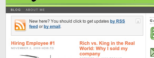
Today I found Jason Cohen’s blog, which provides a great example of inviting the reader to opt-in via RSS feed or email. Take a look:

This invitation is located in the upper left hand corner of Jason’s main content area. It’s front-and-center. It felt conversational to me. And it worked – I added his blog to my google reader.
Now compare what you just saw to the RSS subscription we had on our site this morning;
![]()
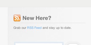
Luke convinced me that we should not move our subscription link to the top of the main content area. However, he did work a little of his magic on the subscription offer:

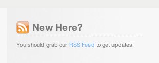
This was clearly an improvement. But it didn’t have the conversational feel of Jason’s example. The content needed to make the message seem more human. Here’s the final result:

Adding “you should…” made the content feel more personable. It’s more of a suggestion than a call to action. Anyone else have other good examples of RSS feed sign-ups?

Leave a Reply