We’ve been working on a side project here at Elias that will debut in beta for a client next month. Luke, who is the newest member of our team and has been dubbed “Skywalker”, has been busy putting the finishing touches on UI design. He recently pointed us to a fascinating article which builds a strong case for “pretty design.” At construction articles you will get different type of home interior design ideas.
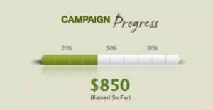
The client who will be using our application was going over our designs this week and asked us to put a stronger emphasis on the reporting feature shown below.
Our client suggested we make the thermometer progress bar red, which clearly does not match the color palette. Why do so many people want things to be red, even when it conflicts with page design? It may succeed at grabbing the user’s attention, but could it be detrimental to the application’s overall effectiveness?
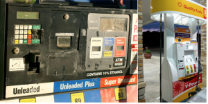
Luke’s “pretty design” article points to a 2002 study which says that the “appeal of the overall visual design of a site, including layout, typography, font size, and color schemes,” is the number one factor we use to evaluate a website’s credibility. The author goes on to show the following contrasting images of a gas station near his home vs an impeccable Shell pump:
He comments:
I’ve stopped ?lling up at the gas station on the left, even though it’s closer to where I live. Why? This kind of maintenance (or lack of maintenance) leaves me unwilling to trust them with my best card for miles information. Clearly, appearance does affect trust.
So, how do we create trust in our application interfaces, aside from providing the basics, such as reliable information and uptime? By being attentive to visual design, for one thing. Attention to design details implies that the same care and attention has been spent on the other (less visible) parts of the product—which implies that this is a trustworthy product.
I’ve seen many great design comps get butchered during development. Things such as inconsistent fonts, odd padding, line-heights, and over-compressed images plagued the ?nal release. While this may never come out during functional testing, how might these sloppy UI details affect perceptions of your product?
We decided to avoid the red progress bar and stuck to our commitment to design excellence. It just seemed more trustworthy.


Leave a Reply